
knead some love bakery

Logo Design
This bakery logo was conceptualized from a client's request for an Art Deco style with a green color palette. I incorporated vintage-inspired elements to create a simple yet distinctive design with contemporary, whimsical appeal—keeping 'LOVE' as the focal point to emphasize the heartfelt feel.
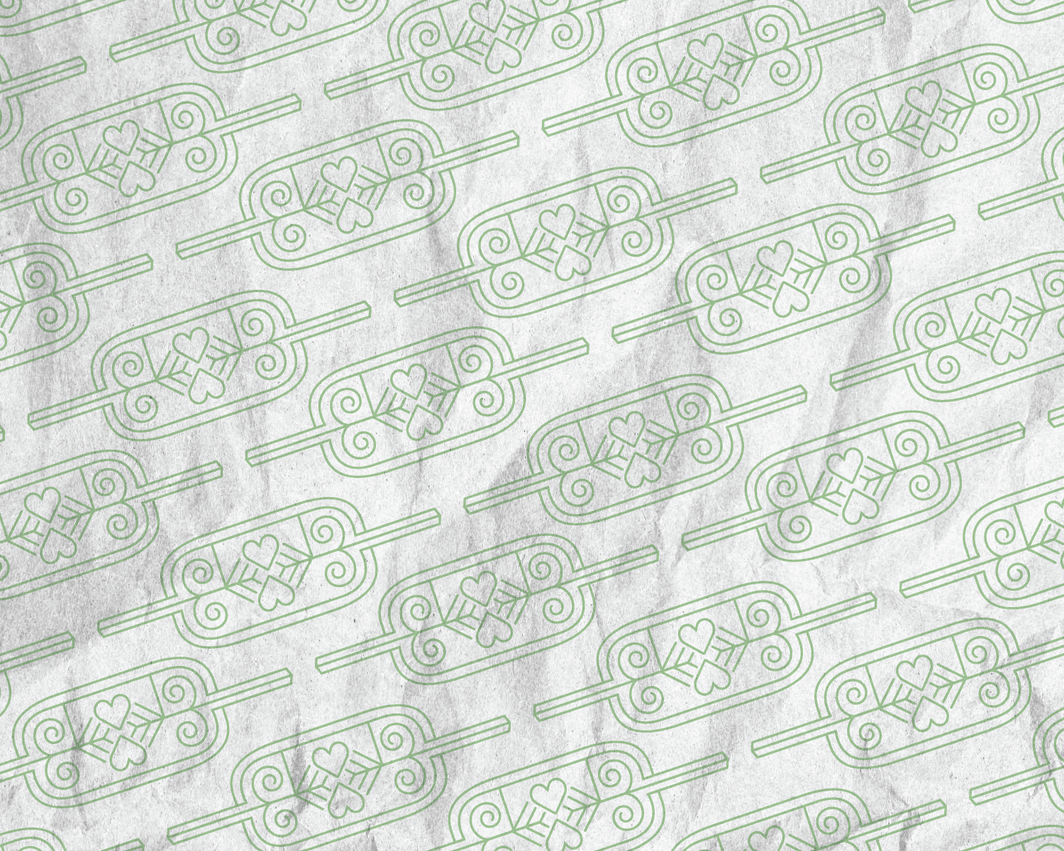
Logo pattern
In thinking of marketing collateral for a bakery, I thought of how the logo could be adapted into packaging. . Inspired by the gentle curves of freshly baked loaves and the classic silhouette of a baker's rolling pin. This simple 1-color pattern could be easily printed on paper to wrap pastries in, or utilized in other designs; such as business cards and murals!

Business card
For fun, I wanted to expand on the brand identity and design business cards. Using the logo design as a starting point, I wanted to create a look that was simple, retro inspired and contemporary.
